Rahmstorf extrapolates out more than five times the measured temperature domain

This is part of a series of posts concerning Problems with the Rahmstorf (2007) paper.

Critique #3. Rahmstorf extrapolates out more than five times the measured temperature domain.

Extrapolation is risky business. Even when the fitted model accurately describes the real data over its domain, extrapolation beyond that domain can lead to very poor predictions. When the fitted model does not accurately describe the measured data (Rahmstorf's unbinned sea level rise rate vs. temperature, see figure 3, here, for example) the result can be truly bizarre. The NIST Engineering Handbook states:


Modeling and prediction allows us to go beyond the data to gain additional insights, but they must be done with great caution. Interpolation is generally safer than extrapolation, but mis-prediction, error, and misinterpretation are liable to occur in either case...The best attitude, and especially for extrapolation, is that the derived conclusions must be viewed with extra caution. !


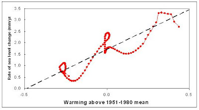
Rahmstorf's projection for future sea level (figure 4 in his paper), is reproduced in part in figure 1, below, and makes it look as if his measurement domain is 120 years and that he has extrapolated out another 100 years. But in reality, his measurement domain was in decrees C of temperature anomaly, and his range was in sea level rise rate. Extrapolating out 100 years based on 120 years of data would be bad enough, but he actually extrapolates out more that 5
°C based on 0.8 °C of data. See figure 2! This is an extrapolation of poorly fit data to over six time the measured data domain!!!

Figure 1. Reproduction of Rahmstorf's figure 4, showing "sea-level projections
from 1990 to 2100." This image gives the impression that it shows an extrapolation from measured sea level data spanning 120 years out for an additional 100 years.

Figure 2. But the real extrapolation is from the sea level rise vs temperature plot. First he fits a straight line to a twisted piece of spaghetti, then extends that line way, way out.

This type extreme form of extrapolation is best summed up by Mark Twain in Life on the Mississippi (1883). Twain writes about effect of cutting across "horseshoe curves" in the river over the years in order to shorten it.

" The Mississippi between Cairo and New Orleans was twelve hundred and fifteen miles long one hundred and seventy-six years ago. It was eleven hundred and eighty after the cut-off of 1722. It was one thousand and forty after the American Bend cut-off. It has lost sixty-seven miles since. Consequently its length is only nine hundred and seventy-three miles at present.

Now, if I wanted to be one of those ponderous scientific people, and `let on' to prove what had occurred in the remote past by what had occurred in a given time in the recent past, or what will occur in the far future by what has occurred in late years, what an opportunity is here! Geology never had such a chance, nor such exact data to argue from! Nor `development of species', either! Glacial epochs are great things, but they are vague--vague. Please observe. In the space of one hundred and seventy-six years the Lower Mississippi has shortened itself two hundred and forty two miles. This is an average of a trifle over one mile and a third per year. Therefore, any calm person, who is not blind or idiotic, can see that in the Old Oolitic Silurian Period, just a million years ago next November, the Lower Mississippi River was upward of one million three hundred thousand miles long, and stuck out over the Gulf of Mexico like a fishing-rod. And by the same token any person can see that seven hundred and forty-two years from now the Lower Mississippi will be only a mile and three-quarters long, and Cairo and New Orleans will have joined their streets together, and be plodding comfortably along under a single mayor and a mutual board of aldermen. There is something fascinating about science. One gets such wholesale returns of conjecture out of such a trifling investment of fact."


Back to series of posts concerning Problems with the Rahmstorf (2007) paper.

1. Rahmstorf, A Semi-Empirical Approach to Projecting Sea Level Rise, Science 315, 368 (2007)

Back to series of posts concerning Problems with the Rahmstorf (2007) paper.

"Warmer Oceans, Stronger Hurricanes," Trenberth, Scientific American, July 2007

Hyperbole comes in many forms. This article in Scientific American came with a full page artist's rendering of a "future hurricane." I have shown a very small (to avoid copyright lawyers) copy of the picture below, with a blow up of one section. The caption for the picture in the magazine says "Future hurricanes could be more severe thanks to global warming." The blow up shows a giant hurricane bearing down on the Mediterranean and the East coast of the United States


Figure 1. The small picture at the left is a miniature version of the 8 inch by 11 inch full page artist's rendering of a "future hurricane" form page 44 of the July 2007 Scientific American. The right side shows a blow up of part of the picture.


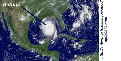
The very first paragraph of the article reminds the reader of the 2005 hurricane season and, of course, Katrina. So, I use a pair of pictures below to compare Katrina to the imagined "future hurricane." The first is a satellite image of Katrina shortly before it made landfall near New Orleans. The second is a detail of the Scientific American picture. Note that the sizes of the images have been adjusted to give the same scale.


Figure 2. Detail of Scientific American picture of "future hurricane" with same scale as image of Hurricane Katrina in figure 3,below.


Figures 3. Satellite image of Hurricane Katrina just hours before making landfall at New Orleans. This image is on the same scale at the artist rendering of a "future hurricane" in figure 2, above.


Figure 4. Juxtaposition of the Scientific American "future hurricane" and the very real Katrina from the satellite image. I have removed land masses from both pictures. Both pictures are on the same scale, as in figures 2 & 3.


Scientific American's "future hurricane" is bigger than the continent of North America. It is so big that it stretches from northern Brazil to southern Canada. It is as large as the North Atlantic Ocean. This is clearly extreme visual hyperbole, but it is also a metaphor for much of the global warming debate, where preposterous exaggerations and extrapolations abound.


Those who are convinced that we are headed for a future of giant hurricanes due to increased CO2 might consider the following journal articles to mitigate the effects of the seemingly endless fear mongering so common in the global warming debate:

1. In Low Atlantic hurricane activity in the 1970s and1980s compared to the past 270 years, Nyberg, et. al., point out that "reliable observations of hurricane activity in the North Atlantic only cover the past few decades." It is not possible to say, based on this short set of data, if the variation that has been seen during these few decades is greater than should be expected over longer time scales. However, they developed a proxy for both sea surface temperature and vertical wind shear covering 270 years. (Vertical wind shear is inversely related to hurricane formation). The result shows that "the average frequency of major hurricanes decreased gradually from the 1760s until the early 1990s, reaching anomalously low values during the 1970s and 1980s." It seems clear that the upswing in hurricane activity seen from the beginning of the satellite era to the present is largely a consequence of the beginning of the satellite era being at the low point of hurricane activity for the last 270 years.


2. The article in Nature, Intense hurricane activity over the past 5,000 years controlled by El Nin˜o and the West African monsoon," by Donnelly and Woodruff of the Woods Hole Oceanographic Institution in Massachusetts echos the concern that "the instrumental record is too short and unreliable to reveal trends in intense tropical cyclone activity." To overcome these limitations they used sediment deposits in coastal lagoons of the Caribbean to gauge hurricane activity on the century and millennial time scales over a 5000 year period. They found the frequency of intense hurricanes varied widely on these time scales during the past 5,000 years and that the frequency appears to be governed by the El Nin˜o/Southern Oscillation and the strength of the West African monsoon." Additionally, " sea surface temperatures as high as at present are not necessary to support intervals of frequent intense hurricanes."

3. The short instrumental record of hurricane activity was a motivation for Miller, et. al. in their 2006 Proceedings of the National Academy of Sciences paper, "Tree-ring isotope records of tropical cyclone activity." As trees grow, the oxygen isotope ratios of the water at that place and time are locked into their rings. It is also known that the precipitation of tropical cyclones and hurricanes have oxygen isotope ratios that are greatly different that more common causes of precipitation. Miller, et. al., examined long leaf pines (pinus pulustris) in Georgia because they have shallow roots and a distinct early season growth and late season growth in their rings. these combine to give a precise temporal fix on isotope ratio variation. Their study covered 1770 to 1990. Their analysis of the tree ring oxygen isotope data shows very close agreement with the instrumental data for the southeastern United States after 1940, verifying the efficacy of their method for earlier times. The overall results indicate "systematic, decadal- to multidecadal-scale variations" in the isotope ratios, and consequently variations in the number of hurricanes. Hurricane activity appears to have peaked in the 1770s, 1800s to 1820s, 1840s and 1850s, 1865 to 1880, and the 1940s to 1950s. The quietest decades are the 1780s through 1790s, and the 1970s. The 1970s saw the beginning of satellite tracking of hurricanes. The fact that there has been an upswing in hurricanes in the satellite record is much less alarming when you consider that the 1970s was one of the least active decades (at least for the southeastern United States) in over 200 years.


Kevin E. Trenberth, "Warmer Oceans, Stronger Hurricanes," Scientific American, July 2007, p44-51. (Get copy here.)

Johan Nyberg, et. al., "Low Atlantic hurricane activity in the 1970s and 1980s compared to the past 270 years," Science, Vol 447, 2007. (Get copy here.)

Jeffrey P. Donnelly & Jonathan D. Woodruff, "Intense hurricane activity over the past 5,000 years controlled by El Nin˜o and the West African monsoon," Nature, Vol 447, 24 May 2007 (Get copy here.)

Dana L. Miller, et. al., "Tree-ring isotope records of tropical cyclone activity," Proceedings of the National Academy of Sciences, PNAS, Vol. 103, no. 39, September 26, 2006 (Get copy here.)

Time for sea level to reach equilibrium is not millennia

This is part of a series of posts concerning Problems with the Rahmstorf (2007) paper.

Critique #2. The assumption that the time required to arrive at the new equilibrium is "on the order of millennia" is not borne out by the data.

This assumption implies that on a century time scale a temperature rise will result in an increase of the sea level rise rate, and the sea level rise rate will not drop back down unless there is a significant drop in the temperature, as illustrated in figure 1, below.


Figure 1. Illustration of a Rahmstorf type model with a temperature step vs. time, the resulting step in the sea level rise rate (dH/dt) vs. time, and the combination of sea level rise rate vs. temperature. This scenario works under the assumption that the adjustment timescale for the sea level rise rate is on the order of millennia.


If the adjustment time were decades instead of millennia, then a temperature step would result in an increase of the sea level rise rate, quickly followed by a drop. This scenario is shown in figure 2, below.


Figure 2. Illustration of a short adjustment time model. As in figure 1, above, it shows a temperature step vs. time, the resulting step in the sea level rise rate (dH/dt) vs. time, and the combination of sea level rise rate vs. temperature.


The actual temperature (GISS) and sea level data (Church, 2006) is not as clean as the simple models illustrated in figures 1 and 2. However, the best example of a simple temperature step occurs between the years 1890 and 1970. Using the 15 year smoothed temperature ( deviation from the 1951 to 1980 average) and sea level rise data it can be seen that from about 1890 to about 1915 the temperature was quite steady (-0.265 ºC ± 0.015 ºC), followed by a rapid rise of about 0.25 ºC by 1940. Then from 1940 to the mid 70s the temperature stays about 0.0 ºC ± 0.015 ºC.

What does the sea level rise rate do during this same period? When the temperature is flat from 1890 to 1915 the sea level rise rate is dropping. As the temperature rises until 1940, the sea level rise rate also rises. Shortly after that the sea level rise rate stars dropping while the temperature remains flat again. Figure 3, below, shows the temperature and sea level rise rate during this interesting time period.


Figure 3. Temperature anomaly and sea level rise rate from 1890 to 1970. Same data that Rahmsdorf used, 15 year smoothing.


According to Rahmstorf's model the sea level rise rate should have been constant during the periods when the temperature was constant. The fact that the sea level rise rate was dropping during both of these periods indicates that the adjustment time is not on the order of millennia, but rather on the order of decades. This has a profound impact on his conclusions. According to Rahmstorf's model, a temperature rise that occurs in the early 1900s would still be contributing to sea level rise in 2100. The data indicates otherwise: the effect of a temperature step on sea level rise diminishes in only decades.

Figure 4. Rahmstorf's and Moriarty's smoothed and binned sea level rise rate vs. temperature anomaly, Moriarty's unbinned version, and Moriarty's unbinned version with the data from figure 3, above, highlighted showing regions of constant temperature and decreasing sea level rise rate.

Back to series of posts concerning Problems with the Rahmstorf (2007) paper.
2. J. A. Church, N. J. White, Geophys. Res. Lett. 33, L01602 (2006).
3. Rahmstorf, A Semi-Empirical Approach to Projecting Sea Level Rise, Science 315, 368 (2007)


Back to series of posts concerning Problems with the Rahmstorf (2007) paper.

Rahmstorf's sea level rise rate vs. T does not fit a line

This is part of a series of posts concerning Problems with the Rahmstorf (2007) paper.

Critique #1. Sea level rise rate vs. temperature is displayed in a way that erroneously implies that it is well fit to a line.

Rahmstorf's figure 2 shows the sea level rise rate vs. temperature in the form of 24 discreet points. These points are derived by binning the 120 points that represent each individual year from 1880 to 2000 into groups of 5 after smoothing the sea level data (Church, 2006) and temperature data (GISS) with with a nonlinear trend technique. My digitized version of his plot is shown in figure 1, below.


Figure 1. Rahmstorf's version of sea level rise rate (mm/year) vs. temperature anomaly.

I smoothed the same sea level data and temperature data with a 15 year FWHM Gaussian filter. Note that the difference between smoothing the sea level data with the nonlinear trend line technique and with the Gaussian filter is vanishingly small, as demonstrated by the fact that I derived the same sea level rise rate vs. temperature as Rahmstorf does (sea level =3.375 *(T anomaly + 1.684, r = 0.86). My plot of sea level rise rate vs. temperature anomaly, which is very similar to Rahmstorf's, is shown below in figure 2. One might plausibly argue that the points in figures 1 and 2 could be reasonably fit to a line. That is precisely the argument that Rahmstorf makes.

Figure 2. Moriarty's version of sea level rise rate vs. temperature anomaly.

However, if the data is not binned, that is, all 120 data points are shown, then it becomes perfectly clear that fitting this data to a line is entirely inappropriate. Figure 3, below, shows the same data as figure 2, without binning.

Figure 3. When the sea level rise rate vs temperature anomaly data is not binned it appears that fitting it to a line is entirely inappropriate.


Rahmstorf seems to justify fitting this very non-linear data to a line by saying "A highly significant correlation of global temperature and the rate of sea-level rise is found (r = 0.88, P = 1.6 × 10⁻⁸) (Fig. 2) with a slope of a = 3.4 mm/year per °C." It should be understood that this is very poor justification. Section 4.4.4 of the The National Institute of Standards and Technology (NIST) Engineering Statistics Handbook says:


Model validation is possibly the most important step in the model building sequence. It is also one of the most overlooked. Often the validation of a model seems to consist of nothing more than quoting the R^2 statistic from the fit (which measures the fraction of the total variability in the response that is accounted for by the model). Unfortunately, a high R^2 value does not guarantee that the model fits the data well. Use of a model that does not fit the data well cannot provide good answers to the underlying engineering or scientific questions under investigation.


Back to series of posts concerning Problems with the Rahmstorf (2007) paper.

1. GISS: http://data.giss.nasa.gov/gistemp/
2. J. A. Church, N. J. White, Geophys. Res. Lett. 33, L01602 (2006).
3. Rahmstorf, A Semi-Empirical Approach to Projecting Sea Level Rise, Science 315, 368 (2007)

Back to series of posts concerning Problems with the Rahmstorf (2007) paper.

_________________________________________________
A Semi-Empirical Approach to Projecting Future Sea-Level Rise," Rahmstorf, Science, Vol 315, 2007

Overview
Rahmstorf's sea level rise rate vs.T does not fit a line
Time for sea level to reach equilibrium is not millennia
Rahmstorf extrapolates out more than five times the measured temperature domain
_________________________________________________