The shrinking of Lake Chad cannot be blamed on anthropogenic CO2

Return to Topics page.
Return to Criticisms of Al Gore's "An Inconvenient Truth"

Gore shows a series of four images of Lake Chad on page 116 of his book. The pictures show the lake shrinking from about 25,000 square kilometers in 1963 to about 1,500 square kilometers in 2001. Very dramatic indeed, this drought was abrupt and catastrophic for the people in this region south of the Sahara desert. Gore implies the following sequence of events: Anthropogenic CO2 causes Lake Chad to dry up, then the stresses caused by this depleted resource cause, or exacerbate, regional violence, famine and genocide.

Gore is wrong for two reasons

1. Lake Chad was shrinking long before anthropogenic increases of CO2. It is known that Lake Chad was vastly bigger several thousand years ago than it was in 1963, when Al Gore starts his tale about the lake’s demise. Paleological evidence makes it clear that abrupt changes have been common and the lake has shrunk to its current size or smaller multiple times in the last thousand years.

2. The current low level of Lake Chad is due, at least in part, to greater demands on the water of the in-flowing rivers. The population of the region has more than doubled since the most recent drought began and a large fraction of the water that would normally flow into the lake is being dammed and diverted for irrigation long before it reaches the lake.

Lake Chad was already shrinking

While he is almost certainly right about water shortages aggravating social problems, he is certainly wrong about anthropogenic CO2 being the cause. His aim goes wildly off the mark when he makes an important, but wrong, point on the page 117 where he says "When it was full, Lake Chad was the sixth largest lake in the world…” This gives the impression that prior to 1963, “when it was full,” the Eden that was Lake Chad had existed in a 25,000 square kilometer steady state perpetually from the deep past.

The truth is that Lake Chad has undergone extraordinary changes in the relatively recent past. The Lake Chad of 1963 was just a tiny remnant of what is known to paleontologists as “Lake Megachad.” Just a relatively short six to seven thousand years ago, when Badarian culture was populating upper Egypt and the Yangshao and Longshan cultures of prehistoric China were cultivating grains, domesticating animals and making villages, Lake Megachad was the biggest lake in the world! It was 400,000 square kilometers – five times bigger than Lake Superior is today! 7000 years ago its surface area was 16 times bigger than it was in 1963, and its volume was dozens of times greater. In the Journal The Holocene, Drake and Bristow (2006) point out that Lake Megachad may have been as large as 800,000 square kilometers further back in time.

According to Section 3.1 of the United Nations Environmental Programme (UNEP) report, Africa’s Lakes – Atlas of Our Changing Environment, Lake Chad “levels regressed until, between 5,000 and 2,500 years ago, the lake assumed its current level with periodic oscillations. By 1908 the lake levels were so low that the lake resembled a vast swamp with small northern and southern pools. During the 1950s, levels again increased, joining the southern and northern pools, so by 1963 the lake covered 22,902 km2 (8,842 square miles).” Note that 1963 is the year the Gore conveniently starts his tale about Lake Chad. Somehow he forgets to tell his readers and viewers that 1963 Lake Chad was at its highest level for the entire 20th century. (See figure 1.) In fact, the lake size increased dramatically during the 50 years previous to 1963. Gore’s narrative would not be quite so compelling if he had started it in 1908, because by 2001 the lake level was almost the same as it was back in 1908.

Butzer (1983) did a comprehensive paleo-environmental review of Lake Chad and the entire Sahel to put the recent drought into historical perspective. He took into account stream deposits, fossil sands, lake beds, abandoned shorelines, paleosols, fossil pollen and lake microorganisms. He says the primary record has been “well fixed in temporal terms by an unusually large number of radiocarbon dates.” The paper gives numerous examples of rapid rises and falls for Lake Chad over the last 20,000 years. Comparison of the Lake Chad data to data from the rest of the Sahel “shows that the history of Lake Chad is fully representative of hydrological changes across the Sahel.” He concludes with “The lake records discussed here are among the most detailed available for the Late Quaternary of Africa.” He points out that droughts like the most recent one “are verified on at least 6 occasions since 1400 AD, and may have a recurrence frequency of three times per century.” This drought, he says, “falls well within the range of short and medium variability directly documented for the last few centuries and indirectly shown for the last 12 millenia.”


Figure 1. 130 year history of Lake Chad elevation. Note that the 20th century maximum occurred in 1963. The rapid elevation drop at the end of the 19th century occur ed before significant increased in anthropogenic CO2. The most recent elevation data has the lake level almost as high as it was 100 years previous. Double click the image to see a larger version.

And there’s more. There were other megalakes that existed in the Sahara. Lake Megafezzan was north of Lake Megachad in present day Libya, the Chotts Megalake was in present day northern Algeria and the Ahnot-Moyer Megalake in central Algeria. Figure 2 shows a map of North Africa with the now missing megalakes. The inset of the North American Great Lakes (from Google Earth) is at the same scale and is included for comparison purposes. These lakes did not dry up millions of years ago. They still existed as bodies of fresh water during in the mid-holocene just thousands of years ago, when human beings had already spread over the entire globe. It clearly was not anthropogenic CO2 that caused the mega-lakes to dry up or Lake Chad to shrink and oscillate so widely in the previous several millenia. How can “An Inconvenient Truth” make the claim that anthropogenic CO2 is responsible for Lake Chad’s recent shrinking and oscillations when this is a continuation of a long existing pattern.


Figure 2. The Megalakes of the Sahara region. These gigantic lakes have disappeared in recent millenia. Lake Chad is the only remaining trace of water from these giants. The inset shows the North American Great Lakes at the same scale (from Google Earth) for comparison purposes. The megalake size and shape data is from the Megalakes Project. Double click on the image to see a larger version.

Figure 3. The site of Lake Megafezzan as it appears today. All that remains is sand. (Image from Google Earth)

Larger and larger fractions of the in-flowing water is being diverted before it reaches the lake.

A major contributing factor to Lake Chad’s reduced size in the 21st century is the human manipulation of the water system through damming and irrigation. Multiple dams and irrigation systems have been built upstream on the rivers that feed the lake. The Global International Waters Assessment (GIWA) report by the University of Kalamar on behalf of the United Nations Environmental Programme states that

“The GIWA Assessment considered anthropogenic stream flow modification as having a severe impact on freshwater availability. Although the Lake has already dried out several times in the past and therefore recent shrinkage is not a new phenomenon, the trend has been severely exacerbated by human stream flow modification….In areas of the Lake Chad Basin, despite the relative abundance of water at times, the flow of rivers has been constantly diminishing (Nami 2002) partly due to decreasing rainfall in the hydrologically active upstream basins but also as a consequence of the increased abstraction for human consumption. This abstraction has dramatically modified stream flow through the construction of dams upstream of the catchment, that have not taken sufficient account of the people and ecosystems downstream of the development.”

A profound example of the impact of human diversion of water from Lake Chad is illustrated in the (UNEP) report mentioned above, where it is pointed out that “Since the 1960’s human demands for water near Lake Chad have grown rapidly. Between 1960 and 1990, the number of people living in the lake’s catchment area has doubled from 13 million to 26 million.” This growing need for water has resulted in huge irrigation projects and dams along the rivers that feed Lake Chad. Of the Komadougou-Yube river system the report states “The upper basin used to contribute approximately 7 km3/yr to Lake Chad. Today, the bulk of this water is impounded in reservoirs within Kano province in northern Nigeria, and the system provides just 0.45 km3/yr.” By my calculations that is enough impounded water each year to double the current volume of the Lake.

The greatest inflow to Lake Chad comes from the south via the Chari-Logone River. However, since the 1970s the Chari-Logone stream flow has been drastically modified. The construction of the 30 kilometer wide Maga Dam for the creation of Maga Lake, and 80 kilometers of dykes along the Lagone downstream from the dam have had a profound impact in Lake Chad. This construction was part of the well intentioned SEMRY irrigation project to open up more agricultural land (mostly rice) and fish farming. According to GIWA, "This diversion of water from the Chari River for agricultural purposes has contributed to the decreasing stream flows and the discharges into, and extent of, the Lake Chad....According to expert opinion the most significant GIWA assessed immediate cause [for low stream flow into Lake Chad] is the increased diversion of rivers and the associated unsustainable use of water resources."

Return to Topics page.
Return to Criticisms of Al Gore's "An Inconvenient Truth"

References
Drake and Bristow, Shorelines in the Sahara: geomorphological evidence for an enhanced monsoon from palaeolake Megachad, The Holocene, Vol. 16, No. 6, 901-911 (2006)
DOI: 10.1191/0959683606hol981rr. Get copy here

United Nations Environmental Programme (UNEP) report, Africa’s Lakes – Atlas of Our Changing Environment, section 3.1 Get copy here

Butzer, K.W., Paleo-Environmental Perspectives on the Sahel drought of 68-73, GeoJournal 7.4, 369-374 (1983) Get copy here

Global International Water Assessement (GIWA) , Lake Chad Basin – GIWA Regional assessment 43 - assessment, Get copy here


Return to Topics page.
Return to Criticisms of Al Gore's "An Inconvenient Truth"


Neither Katrina or any other hurricane or cyclone can be attributed to anthropogenic global warming

Return to Topics page.
Return to
Criticisms of Al Gore's "An Inconvenient Truth"

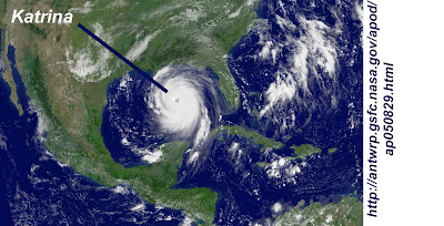
The high court of London found that An Inconvenient Truth "uses emotive images of Hurricane Katrina and suggests that this has been caused by global warming" which is simply not provable.


The deadliest cyclone in recorded history was Cyclone Bhola, which struck Bangladesh (then part of Pakistan) in 1970. Estimates for the number killed range from 200,000 to 1,000,000 people. Like Katrina, this storm was classified as a category 3 when it made landfall. But unlike Katrina it did not have minute by minute satellite tracking. What was its maximum wind speed while it was over the ocean? It was reported to be 185 mph the day it made landfall, but nobody knows for sure. I'd like to show some large high resolution color pictures of the devastation and the suffering of the people, just like Al Gore did for Katrina, but there are few to be found. You can see several grainy low resolution black and white pictures here.


There were no cell phone cameras, few personal cameras and few, if any, television cameras in Bhola at that time. Although there were at least a hundred times the number of casualties due to the Bhola cyclone than due to Hurricane Katrina, most people today have never heard of the Bhola cyclone. Those in the United States that do remember Cyclone Bhola are probably fans of George Harrison's "The Concert for Bangladesh." (A great concert. by the way, featuring Harrison, Ringo Starr, Bob Dylan, Eric Clapton and more.)


Figure 1. Movie poster for "The Concert for Bangladesh


If you google "Katrina" and "hurricane" you will get 34 million hits. If you google "Bhola" and "cyclone" you will get 10 thousand hits. 3,400 hits on Katrina for every one hit on Bhola. Shortly after Cyclone Bhola the Bulletin of the American Meteorological Society published a paper by Neil Frank of the National Hurricane Center in Florida and S.A. Husain of the Pakistan Meteorological Department entitled "The Deadliest Tropical Cyclone in History?" They list five other hurricanes where the loss of life is believed to be more than 100,000 people. Four of the five are all prior to the 20th century. But the numbers are highly speculative. Before the days of mass communication its was hard to tell how many people died due to a storm in a neighboring village, let alone on the other side of the Earth.


The same effect holds for judging the meteorological parameters of storms. Since the 1970s tropical cyclones have been tracked from space with continuously improving technology. Aircraft have been used to study and track hurricanes starting in the mid 1940s. Prior to that, tracking relied of data from ships and islands while the storms were at sea, and from land side observations once a storm hit shore. So, as technology has advanced, the quality of data has advanced.


J.P. Kossin of the Cooperative Institute for Meteorological Satellite Studies, University of Wisconsin-Madison, wrote in the Journal Geophysical Research Letters (2007) that "The variability of the available data combined with long time-scale changes in the availability and quality of observing systems, reporting policies, and the methods utilized to analyze the data make the best track records inhomogeneous by construction" Even in the short satellite era the quality of the data has continuously improved so that Kossin says "the known lack of homogeneity in both the data and techniques applied in the post-analyses has resulted in skepticism regarding the consistency of the best track intensity estimates." Kossin, et. al., re-analysed the satellite data used in the frequently cited paper by Webster that purported to show an increasing trend in tropical cyclones in the six major cyclone basins (West Pacific, East Pacific, South Pacific, Northern Indian, Southern Indian and North Atlantic). But first they made the data quality consistent by reducing the spatial and temporal resolution of the newer data to match the resolution of the older data (8 kilometers and 3 hours).


Kossin, et. al., found that the global increasing hurricane trend reported by Webster disappeared when data of consistent quality were used. While Webster found increasing trends in 5 of the six basins, Kossin found a significantly increasing trend in only one basin (the North Atlantic). In fact Kossin found a small decreasing global trend.


Christopher Landsea (of the NOAA National Hurricane Center) et. al., drew similar conclusions in the Journal Science in 2006. He points out that in 1975 there were only two geostationary satellites with 9 km resolution used to monitor tropical storms. Today there are eight geostationary satellites with 4 km resolution to do the same monitoring. More important than the number of satellites is the fact that with only two satellites much of the imagery is from oblique angles. Consequently, "The resulting higher resolution images and more direct overhead views of tropical cyclones result in greater and more accurate intensity estimates in recent years." Lansea explains that the satellite image pattern recognition method, called the "Dvorak Technique," which is relied on to make storm intensity estimates is highly subjective and tends to give different results when applied by different analysts. Originally the Dvorak Technique was applied only to visible light images (that is daylight images), but was later (1984) applied to infrared images as well.


As an example, Landsea shows satellite images of five North Indian Ocean cyclones taken between 1978 and 1989. Each of these cyclones were listed as reaching category 3 at the time. But reanalysis of the these images using current procedures would result in the storms being classified as category 4 or category 5 today. The implication is that even during the satellite era storm intensity was underestimated in the past compared to the present.


Is the satellite era long enough to judge whether current level of tropical cyclone activity falls outside the natural range?


The only way to answer this question is through paleoclimatological studies. A variety of such studies relating to this question have been done. The paleoclimatological evidence is quite clear: Current hurricane and cyclone activity is NOT unusual from a long term perspective. Several examples of such studies follow:


1. In Low Atlantic hurricane activity in the 1970s and1980s compared to the past 270 years, Nyberg, et. al., point out that "reliable observations of hurricane activity in the North Atlantic only cover the past few decades." It is not possible to say, based on this short set of data, if the variation that has been seen during these few decades is greater than should be expected over longer time scales. However, they developed a proxy for both sea surface temperature and vertical wind shear covering 270 years. (Vertical wind shear is inversely related to hurricane formation). The result shows that "the average frequency of major hurricanes decreased gradually from the 1760s until the early 1990s, reaching anomalously low values during the 1970s and 1980s." It seems clear that the upswing in hurricane activity seen from the beginning of the satellite era to the present is largely a consequence of the beginning of the satellite era being at the low point of hurricane activity for the last 270 years.


2. The article in Nature, "Intense hurricane activity over the past 5,000 years controlled by El Nin˜o and the West African monsoon," by Donnelly and Woodruff of the Woods Hole Oceanographic Institution in Massachusetts echos the concern that "the instrumental record is too short and unreliable to reveal trends in intense tropical cyclone activity." To overcome these limitations they used sediment deposits in coastal lagoons of the Caribbean to gauge hurricane activity on the century and millennial time scales over a 5000 year period. They found the frequency of intense hurricanes varied widely on these time scales during the past 5,000 years and that the frequency appears to be governed by the El Nin˜o/Southern Oscillation and the strength of the West African monsoon." Additionally, " sea surface temperatures as high as at present are not necessary to support intervals of frequent intense hurricanes."


3. The short instrumental record of hurricane activity was a motivation for Miller, et. al. in their 2006 Proceedings of the National Academy of Sciences paper, "Tree-ring isotope records of tropical cyclone activity." As trees grow, the oxygen isotope ratios of the water at that place and time are locked into their rings. It is also known that the precipitation of tropical cyclones and hurricanes have oxygen isotope ratios that are greatly different that more common causes of precipitation. Miller, et. al., examined long leaf pines (pinus pulustris) in Georgia because they have shallow roots and a distinct early season growth and late season growth in their rings. these combine to give a precise temporal fix on isotope ratio variation. Their study covered 1770 to 1990. Their analysis of the tree ring oxygen isotope data shows very close agreement with the instrumental data for the southeastern United States after 1940, verifying the efficacy of their method for earlier times. The overall results indicate "systematic, decadal- to multidecadal-scale variations" in the isotope ratios, and consequently variations in the number of hurricanes. Hurricane activity appears to have peaked in the 1770s, 1800s to 1820s, 1840s and 1850s, 1865 to 1880, and the 1940s to 1950s. The quietest decades are the 1780s through 1790s, and the 1970s. The 1970s saw the beginning of satellite tracking of hurricanes. The fact that there has been an upswing in hurricanes in the satellite record is much less alarming when you consider that the 1970s was one of the least active decades (at least for the southeastern United States) in over 200 years.

It is quite clear, based on the best analysis of satellite data and paleoclimatological data, that the high court of London ruled correctly when saying that Al Gore had not proved his case when implying that Hurricane Katrina could be attributed to anthropogenic global warming.


Jeffrey P. Donnelly & Jonathan D. Woodruff, "Intense hurricane activity over the past 5,000 years controlled by El Nin˜o and the West African monsoon," Nature, Vol 447, 24 May 2007 (Get copy here)

Neil L. Frank and S.A. Husain, "The Deadliest Tropical Cyclone in History?," Bulletin of the American Meteorological Society, Vol 52 No. 6, June 1971 (Get copy here)

J. P. Kossin, "A globally consistent reanalysis of hurricane variability and trends," Geophysical Research Letters, Vol. 34, 2007 (Get copy here)

Christopher Landsea, et. al., "Can We Detect Trends in Extreme Tropical Cyclones?," Science, Vol 313, July 2007 (Get copy here)

Dana L. Miller, et. al., "Tree-ring isotope records of tropical cyclone activity," Proceedings of the National Academy of Sciences, PNAS, Vol. 103, no. 39, September 26, 2006 (Get copy here.)

Johan Nyberg, et. al., "Low Atlantic hurricane activity in the 1970s and 1980s compared to the past 270 years," Science, Vol 447, 2007. (Get copy here.)

P.J. Webster, et.al., "Changes in Tropical Cyclone Number, Duration, and Intensity in a Warming Environment," Science 309, 1844 (2005) (Get copy here)


Return to Topics page.
Return to
Criticisms of Al Gore's "An Inconvenient Truth"

Gore implies ice cores proves that rising CO2 causes temperature increases over 650,000 years

Return to Topics page.
Return to
Criticisms of Al Gore's "An Inconvenient Truth"

In the very compelling graph from "An Inconvenient Truth" shown below in figure 1, Al Gore shows the close correlation between CO2 and temperature. The implication is clear: the temperature increase is controlled by the CO2 level. His simple model is illustrated in the block diagram in figure 2, but one is left wondering what controlled the level of CO2 before humans started burning fossil fuels.

Figure 1. Al Gore showing temperature and CO2. The present is on the right near his head and the past is on the left.


Figure 2. Gore's simple model is: CO2 controls temperature. Nothing more need be said. But what controlled the CO2 before humans burned fossil fuels?


Gore is an advocate for a certain point of view, not an objective scientist, so perhaps he can be forgiven for leaving out a fundamental point concerning this relationship. That point is illustrated below in figure 3, which shows part of page 431 from the journal Nature, 3 June, 1999. The article is "Climate and atmospheric history of the past 420,000 years from the Vostok ice core, Antarctica" by J. R. Petit, et. al., (scientists from France, Russia, and the United States). The graph in figure 3 shows the same data that Gore is standing in front of in figure 1, plus several other things that Gore doesn't show. Please note that Gore's graph shows the present at the right and the Petit paper shows the present at the left. On Petit's graph CO2 level is circled on top, temperature is circled in the middle of the graph, and the insolation at 65 degrees latitude is circled at the bottom.


Figure 3. Graph from Petit paper showing CO2 and temperature (same as Gore is showing in figure 1) and insolation (which Gore apparently forgot to show). Note that the time direction is reverse between Gore's graph and Petit's graph.


The most important thing that Gore does not show is the changing insolation pattern. Insolation is the amount of light from the sun that shines on a particular place. It is important to understand that neither the temperature nor CO2 level can influence the insolation. According to Andre Berger, in the Journal of Atmospheric Sciences, the source for Petit's insolation data, the insolation is primarily governed by "the eccentricity, the longitude of the perihelion, the precessional parameter and the obliquity" of the Earth's orbit. If there is any correlation between the insolation and the temperature, or the insolation and the CO2 level, then the insolation must be driving the correlation, not the temperature or CO2.

Figure 4, below shows my digitized version of the temperature and CO2 level over the last 150,000 years from the Petit (1999) paper. This time period covers the current interglacial (warm)period, the previous ice age, and the interglacial prior to the ice age. Compare the data in figure 3 with Gore's data in figure 1. They are, in fact, the same (although I show the unsmoothed and smoothed temperature, while Gore shows only his smoothed temperature). Figures 5 through 7 show the temperature, CO2 level, and relative ice volume each compared with the insolation for the last 150,000 years.


Figure 4. Digitized version of data from figure 3 or Petit, et. al. (1999). I have included the unsmoothed version of temperature data overlaid by a smoothed version. Gore shows only a smoothed version. See text below for explanation of relationship between deuterium isotope ratio and temperature.


Figure 5. Temperature at Vostok, Antarctica and insolation at 65 degrees north over the last glacial - interglacial cycle. Insolation, the magnitude of solar radiation, shown here as a deviation from an average. Both sets of data are digitized from figure 3 of Petit's (1999) paper.


Figure 6. CO2 at Vostok, Antarctica and insolation at 65 degrees north over the last glacial - interglacial cycle. Both sets of data are digitized from figure 3 of Petit's(1999) paper.


Figure 7. Ice Volume and insolation at 65 degrees north over the last glacial-interglacial cycle. Ice volume is digitized from figure 2 of Petit's(1999) paper.


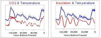
Early in Gore's movie and book he relates an anecdote about his sixth grade classmate who, upon seeing a map of the Earth, wondered whether or not South America and Africa once fit together. The teacher responded "Of course not! That's the most ridiculous thing I've ever heard!" Gore says "That sixth-grade teacher had an assumption in his mind that he didn't bother to question: Continents are so big, obviously they don't move." The moral of the story being, of course, that the CO2 and temperature graphs do fit together and an unprejudiced child can see it. I wonder what Gore's classmate would say if he saw the two side by side graphs of figure 8, below.


Figure 8. Would Gore's sixth grade classmate only see the relationship between CO2 and temperature in the graph on the left? Or would he also see the relationship between insolation and temperature in the graph on the right? Was Gore talking about himself when he quoted Mark Twain: "It ain't what you don't know that gets you into trouble. It's what you know for sure that just ain't so."

It is clear that in the relationship between CO2, temperature, and insolation only insolation can be the primary driver. According to Andre Berger, in the Journal of the Atmospheric Sciences, Insolation is controlled by the "eccentricity, the longitude of the perihelion, the processional parameter and the obliquity" of the Earth's orbit.

Hubertus Fischer (1999)(Scripps Institution of Oceanography) wrote about Ice core records of Atmospheric CO2 Around the Last Three Glacial Terminations, in the Journal Science and concluded "High resolution records from Antarctic ice cores sow that carbon dioxide concentrations increased... 600 ± 400 years after the warming..." That is, as the last three ice ages ended and temperatures started rising, the CO2 lagged behind the temperature rise, indicating that CO2 was not the primary driver of temperature rise.

The timing between CO2 and temperature rise for climate transitions was also studied by Manfred Mudelsee of the Institute of Meteorology at the University of Leipzig. He reported his findings in the Quaternary Science Reviews in 2001. He used a "lagged, generalized least-squares regression" technique to conclude that the Vostok ice records show "CO2 variations lag behind atmospheric temperature changes in the Southern Hemisphere by 1.3 ± 1.0 ka."

More recently Lowell Stott (2007) from the department of Earth Sciences at the University of Southern California wrote about the end of the last ice age in the Journal Science. He points out that temperature led "the rise of in atmospheric CO2 and tropical surface ocean warming by ~1000 years." He explains the following sequence of events: 1. "The trigger for the initial deglacial warming around Antarctica was the change in solar insolation over the Southern Ocean during austral spring that influenced the retreat of sea ice." 2. "Retreating sea-ice would have led to enhanced Ekman transport in the Southern Ocean and decreased stratification due to stronger air-sea fluxes. 3. "These forcings promoted enhanced ventilation of the deep sea and subsequent rise in atmospheric CO2."

My interpretation of the papers by Fischer, Mudelsee, and Stott, as well as the correlation between insolaton, temperature and CO2 suggest that Gore's simple model is better replaced by the more realistic model shown in figure 9, below.


Figure 9. This model is more realistic than Gore's. It does not start with a mystery about what controlled CO2 levels before humans started burning fossil fuels. Insolation is the primary controller of temperature. Temperature controls CO2 with a small feedback.

Return to Topics page.
Return to
Criticisms of Al Gore's "An Inconvenient Truth"

Melting snows on Mt. Kilimanjaro are not evidence of global warming.

Return to Topics page.
Return to
Criticisms of Al Gore's "An Inconvenient Truth"

What is the extent of Al Gore's argument that Mount Kilimanjaro, in Tanzania, is an indicator of the effects of global warming? In his book he simple shows a series of three pictures: one taken in 1970, one taken in 2000, and one taken in 2005. The two pictures from 1970 and 2000 are taken from the same angle and thus allow the reader to see a large change in the glacial cover. The entire text consists of 109 words and can be seen in my reproductions of pages 42 through 45 in figures 1 and 2 below.


Figure 1. Reproductions of pages 42 and 43 of An Inconvenient Truth. I have "photoshopped" the images from these pages to make the snow and glaciers stand out more clearly. The obvious point that the reader is supposed to be impressed with is the dramatic decline in snow and glaciers on Kilimanjaro between 1970 and 2000.


Figure 2. Reproductions of pages 44 and 45 of An Inconvenient Truth. I have "photoshopped" the images from these pages to make the snow and glaciers stand out more clearly. The reader is supposed to note the further decline in the glaciers up to 2005. But note that the picture is taken form a different angle than those on pages 42 and 43.


In the movie version of An Inconvenient Truth these same pictures are shown with Al Gore speaking over them saying essentially the same thing seen in the text of the above images. That's all there is. There are no references to any scientific studies done concerning these glaciers and the possible causes for their retreats. We are simply shown these compelling photographs and the clear impression is left that this shrinkage is caused by CO2 induced global warming.


What does the best science say concerning the glaciers on Kilimanjaro?


Georg Kaser (Tropical Glaciology Group, Department of Geography, University of Innsbruck). et. al., concluded in the International Journal of Climatology in 2004 that since the end of the ice age Kilimanjaro's glacial extensions and recessions reached their maximum in the Little Ice Age. That is, the glaciers on Kilimanjaro were smaller one or two or three thousand years ago than they were 150 years ago. Then around 1880, long before the atmospheric CO2 concentration showed a significant increase, a climate shift caused them to start receding from their Little Ice Age maximum. On page 336 of the journal article they said that temperature increases "have not contributed to the recession process on the summit so far."


Philip Mote (Department of Atmospheric Sciences, University of Washington Climate Impacts Group) et. al. said in a recent article in American Scientist, "The observations ... point to a combination of factors other than warming air—chiefly a drying of the surrounding air that reduced accumulation and increased ablation—as responsible for the decline of the ice on Kilimanjaro since the first observations in the 1880s." They continue, "If human-induced global warming has played any role in the shrinkage of Kilimanjaro's ice, it could only have joined the game quite late, after the result was already clearly decided, acting at most as an accessory..."


Thomas Molg (Innsbruck University Network of Climate and Cryospheric Research) and Douglas Hardy (Climate System Research Center, Department of Geosciences, University of Massachusetts) pointed out in the Journal of Geophysical Research that "it has been speculated that general global warming is directly driving the retreat of Kilimanjaro’s glaciers [e.g., Irion, 2001]. However, detailed analyses of glacier retreat in the global tropics uniformly reveal that changes in climate variables related to air humidity prevail in controlling the modern retreat..."

Gore refers to his "friend, Dr. Lonnie Thompson" and said "He predicts that within 10 years there will be no more 'Snows of Kilimanjaro.'" But Thompson's paper Kilimanjaro Ice Core Records: Evidence of Holocene Climate Change in Tropical Africa in the journal Science in 2002 is clearly not a ringing endorsement for Gore's claim that the recession of Kilimanjaro's glaciers is due to anthropogenic CO2. In fact, nowhere in the article is the term "CO2" ever mentioned. Thompson acquired and studied six ice cores from the oldest glaciers near the summit. In the Northern Ice Field (NIF), which supplied the oldest three ice cores (NIF1, NIF2, and NIF3), only one of the cores (NIF3) indicates that its position was covered with ice at the end of the ice age. Thompson's analysis of the ice core data "suggests that, at ~4 ka [4 thousand years ago], the NIF was smaller than it is today and that the crater-side ice wall likely retreated past the present-day sites of NIF1 and NIF2." (emphasis added by Moriarty).

Thompsom provides abundant evidence that the climate in tropical Africa has undergone huge and rapid changes multiple times since the end of the ice age (12,000 years ago). For example, 11,000 to 4,000 years ago lakes in the area were up to 100 meters higher than today. Lake Chad in sub-Saharan Africa expanded "from 17,000 km2 to cover an area between 330,000 and 438,000 km2, comparable to that of the Caspian Sea today." Then it receded back to its present size (17,000 km2) 4,000 years ago when "conditions became cooler and drier." In fact Thompson states "The Kilimanjaro record documents three abrupt climate changes in this region: at 8.3, 5.2, and 4 ka." ("ka" means "thousand years ago").

It is true that Thompson says "if climatological conditions of the past 88 years continue, the ice on Kilimanjaro will likely disappear between 2015 and 2020." But nowhere in this paper does he even attempt to link the principle drivers of this ice loss to anthropogenic CO2.


Brief look at CO2, temperature and ice extent at Kilimanjaro


Figure 3. Atmospheric CO2 concentration vs. Kilimanjaro ice extent. CO2 data up to 1953 is from the Siple ice core. CO2 data after 1953 is from Mauna Loa, Hawaii. Ice extent for 1880 is from Osmaston, H. 1989. Glaciers, glaciation and equilibrium line altitudes on Kilimanjaro. In Quaternary and Environmental Research on East African Mountains, ed. W. C. Mahaney. Rotterdam: Brookfield, pp. 7-30. Ice extent from 1912 to present is from "Kilimanjaro Glaciers: Recent areal extent from satellite data and new interpretation of observed 20th century retreat rates" Cullen, et. al., GRL 33, 2006


Figure 4. Kilimanjaro summit temperature and ice extent. Ice extent data is the same as figure 3 and the temperature dat is from the National Centers for Environmental Prediction/National Center for Atmospheric Research; compiled by Doug Hardy, University of Massachusetts, Amherst. I have digitized the data from a graph adapted by Tom Dunne.

Return to Topics page.
Return to
Criticisms of Al Gore's "An Inconvenient Truth"

Criticisms of Al Gore's "An Inconvenient Truth"

Return to Topics Page

Al Gore's An Inconvenient Truth became a big part of the British secondary educational landscape when it was made part of the official curriculum. This was big victory for those who feel the world is in imminent danger because of anthropogenic global warming. However, the High Court of London recently said "not so fast." Steward Dimmock sued under Section 406(1)(b) of the Education Act 1996, claiming that the movie is a form or political indoctrination. That law says that school governing bodies and head teachers "shall forbid... the promotion of partisan political views in the teaching of any subject in the school".

The court ruled that 1.) in order to show this movie to the children teachers must make clear that the film is a political work and promotes only one side of the argument. 2.) If teachers present the film without making this plain they may be in breach of section 406 of the Education Act 1996 and guilty of political indoctrination. 3.) Nine inaccuracies have to be specifically drawn to the attention of school children.

I will use these nine cited inaccuracies as a jumping off point for my criticisms of An Inconvenient Truth, both the book and film. These nine inaccuracies are:

  • The film claims that melting snows on Mount Kilimanjaro evidence global warming. The Government’s expert was forced to concede that this is not correct. more...

  • The film suggests that evidence from ice cores proves that rising CO2 causes temperature increases over 650,000 years. The Court found that the film was misleading: over that period the rises in CO2 lagged behind the temperature rises by 800-2000 years. more...

  • The film uses emotive images of Hurricane Katrina and suggests that this has been caused by global warming. The Government’s expert had to accept that it was “not possible” to attribute one-off events to global warming. more...

  • The film shows the drying up of Lake Chad and claims that this was caused by global warming. The Government’s expert had to accept that this was not the case. more...

  • The film claims that a study showed that polar bears had drowned due to disappearing arctic ice. It turned out that Mr Gore had misread the study: in fact four polar bears drowned and this was because of a particularly violent storm. more...

  • The film threatens that global warming could stop the Gulf Stream throwing Europe into an ice age: the Claimant’s evidence was that this was a scientific impossibility.

  • The film blames global warming for species losses including coral reef bleaching. The Government could not find any evidence to support this claim.

  • The film suggests that sea levels could rise by 7m causing the displacement of millions of people. In fact the evidence is that sea levels are expected to rise by about 40cm over the next hundred years and that there is no such threat of massive migration.

  • The film claims that rising sea levels has caused the evacuation of certain Pacific islands to New Zealand. The Government are unable to substantiate this and the Court observed that this appears to be a false claim.

Return to Topics Page

Rahmstorf extrapolates out more than five times the measured temperature domain

This is part of a series of posts concerning Problems with the Rahmstorf (2007) paper.

Critique #3. Rahmstorf extrapolates out more than five times the measured temperature domain.

Extrapolation is risky business. Even when the fitted model accurately describes the real data over its domain, extrapolation beyond that domain can lead to very poor predictions. When the fitted model does not accurately describe the measured data (Rahmstorf's unbinned sea level rise rate vs. temperature, see figure 3, here, for example) the result can be truly bizarre. The NIST Engineering Handbook states:


Modeling and prediction allows us to go beyond the data to gain additional insights, but they must be done with great caution. Interpolation is generally safer than extrapolation, but mis-prediction, error, and misinterpretation are liable to occur in either case...The best attitude, and especially for extrapolation, is that the derived conclusions must be viewed with extra caution. !


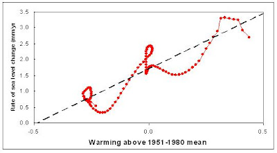
Rahmstorf's projection for future sea level (figure 4 in his paper), is reproduced in part in figure 1, below, and makes it look as if his measurement domain is 120 years and that he has extrapolated out another 100 years. But in reality, his measurement domain was in decrees C of temperature anomaly, and his range was in sea level rise rate. Extrapolating out 100 years based on 120 years of data would be bad enough, but he actually extrapolates out more that 5
°C based on 0.8 °C of data. See figure 2! This is an extrapolation of poorly fit data to over six time the measured data domain!!!

Figure 1. Reproduction of Rahmstorf's figure 4, showing "sea-level projections
from 1990 to 2100." This image gives the impression that it shows an extrapolation from measured sea level data spanning 120 years out for an additional 100 years.

Figure 2. But the real extrapolation is from the sea level rise vs temperature plot. First he fits a straight line to a twisted piece of spaghetti, then extends that line way, way out.

This type extreme form of extrapolation is best summed up by Mark Twain in Life on the Mississippi (1883). Twain writes about effect of cutting across "horseshoe curves" in the river over the years in order to shorten it.

" The Mississippi between Cairo and New Orleans was twelve hundred and fifteen miles long one hundred and seventy-six years ago. It was eleven hundred and eighty after the cut-off of 1722. It was one thousand and forty after the American Bend cut-off. It has lost sixty-seven miles since. Consequently its length is only nine hundred and seventy-three miles at present.

Now, if I wanted to be one of those ponderous scientific people, and `let on' to prove what had occurred in the remote past by what had occurred in a given time in the recent past, or what will occur in the far future by what has occurred in late years, what an opportunity is here! Geology never had such a chance, nor such exact data to argue from! Nor `development of species', either! Glacial epochs are great things, but they are vague--vague. Please observe. In the space of one hundred and seventy-six years the Lower Mississippi has shortened itself two hundred and forty two miles. This is an average of a trifle over one mile and a third per year. Therefore, any calm person, who is not blind or idiotic, can see that in the Old Oolitic Silurian Period, just a million years ago next November, the Lower Mississippi River was upward of one million three hundred thousand miles long, and stuck out over the Gulf of Mexico like a fishing-rod. And by the same token any person can see that seven hundred and forty-two years from now the Lower Mississippi will be only a mile and three-quarters long, and Cairo and New Orleans will have joined their streets together, and be plodding comfortably along under a single mayor and a mutual board of aldermen. There is something fascinating about science. One gets such wholesale returns of conjecture out of such a trifling investment of fact."


Back to series of posts concerning Problems with the Rahmstorf (2007) paper.

1. Rahmstorf, A Semi-Empirical Approach to Projecting Sea Level Rise, Science 315, 368 (2007)

Back to series of posts concerning Problems with the Rahmstorf (2007) paper.

"Warmer Oceans, Stronger Hurricanes," Trenberth, Scientific American, July 2007

Hyperbole comes in many forms. This article in Scientific American came with a full page artist's rendering of a "future hurricane." I have shown a very small (to avoid copyright lawyers) copy of the picture below, with a blow up of one section. The caption for the picture in the magazine says "Future hurricanes could be more severe thanks to global warming." The blow up shows a giant hurricane bearing down on the Mediterranean and the East coast of the United States


Figure 1. The small picture at the left is a miniature version of the 8 inch by 11 inch full page artist's rendering of a "future hurricane" form page 44 of the July 2007 Scientific American. The right side shows a blow up of part of the picture.


The very first paragraph of the article reminds the reader of the 2005 hurricane season and, of course, Katrina. So, I use a pair of pictures below to compare Katrina to the imagined "future hurricane." The first is a satellite image of Katrina shortly before it made landfall near New Orleans. The second is a detail of the Scientific American picture. Note that the sizes of the images have been adjusted to give the same scale.


Figure 2. Detail of Scientific American picture of "future hurricane" with same scale as image of Hurricane Katrina in figure 3,below.


Figures 3. Satellite image of Hurricane Katrina just hours before making landfall at New Orleans. This image is on the same scale at the artist rendering of a "future hurricane" in figure 2, above.


Figure 4. Juxtaposition of the Scientific American "future hurricane" and the very real Katrina from the satellite image. I have removed land masses from both pictures. Both pictures are on the same scale, as in figures 2 & 3.


Scientific American's "future hurricane" is bigger than the continent of North America. It is so big that it stretches from northern Brazil to southern Canada. It is as large as the North Atlantic Ocean. This is clearly extreme visual hyperbole, but it is also a metaphor for much of the global warming debate, where preposterous exaggerations and extrapolations abound.


Those who are convinced that we are headed for a future of giant hurricanes due to increased CO2 might consider the following journal articles to mitigate the effects of the seemingly endless fear mongering so common in the global warming debate:

1. In Low Atlantic hurricane activity in the 1970s and1980s compared to the past 270 years, Nyberg, et. al., point out that "reliable observations of hurricane activity in the North Atlantic only cover the past few decades." It is not possible to say, based on this short set of data, if the variation that has been seen during these few decades is greater than should be expected over longer time scales. However, they developed a proxy for both sea surface temperature and vertical wind shear covering 270 years. (Vertical wind shear is inversely related to hurricane formation). The result shows that "the average frequency of major hurricanes decreased gradually from the 1760s until the early 1990s, reaching anomalously low values during the 1970s and 1980s." It seems clear that the upswing in hurricane activity seen from the beginning of the satellite era to the present is largely a consequence of the beginning of the satellite era being at the low point of hurricane activity for the last 270 years.


2. The article in Nature, Intense hurricane activity over the past 5,000 years controlled by El Nin˜o and the West African monsoon," by Donnelly and Woodruff of the Woods Hole Oceanographic Institution in Massachusetts echos the concern that "the instrumental record is too short and unreliable to reveal trends in intense tropical cyclone activity." To overcome these limitations they used sediment deposits in coastal lagoons of the Caribbean to gauge hurricane activity on the century and millennial time scales over a 5000 year period. They found the frequency of intense hurricanes varied widely on these time scales during the past 5,000 years and that the frequency appears to be governed by the El Nin˜o/Southern Oscillation and the strength of the West African monsoon." Additionally, " sea surface temperatures as high as at present are not necessary to support intervals of frequent intense hurricanes."

3. The short instrumental record of hurricane activity was a motivation for Miller, et. al. in their 2006 Proceedings of the National Academy of Sciences paper, "Tree-ring isotope records of tropical cyclone activity." As trees grow, the oxygen isotope ratios of the water at that place and time are locked into their rings. It is also known that the precipitation of tropical cyclones and hurricanes have oxygen isotope ratios that are greatly different that more common causes of precipitation. Miller, et. al., examined long leaf pines (pinus pulustris) in Georgia because they have shallow roots and a distinct early season growth and late season growth in their rings. these combine to give a precise temporal fix on isotope ratio variation. Their study covered 1770 to 1990. Their analysis of the tree ring oxygen isotope data shows very close agreement with the instrumental data for the southeastern United States after 1940, verifying the efficacy of their method for earlier times. The overall results indicate "systematic, decadal- to multidecadal-scale variations" in the isotope ratios, and consequently variations in the number of hurricanes. Hurricane activity appears to have peaked in the 1770s, 1800s to 1820s, 1840s and 1850s, 1865 to 1880, and the 1940s to 1950s. The quietest decades are the 1780s through 1790s, and the 1970s. The 1970s saw the beginning of satellite tracking of hurricanes. The fact that there has been an upswing in hurricanes in the satellite record is much less alarming when you consider that the 1970s was one of the least active decades (at least for the southeastern United States) in over 200 years.


Kevin E. Trenberth, "Warmer Oceans, Stronger Hurricanes," Scientific American, July 2007, p44-51. (Get copy here.)

Johan Nyberg, et. al., "Low Atlantic hurricane activity in the 1970s and 1980s compared to the past 270 years," Science, Vol 447, 2007. (Get copy here.)

Jeffrey P. Donnelly & Jonathan D. Woodruff, "Intense hurricane activity over the past 5,000 years controlled by El Nin˜o and the West African monsoon," Nature, Vol 447, 24 May 2007 (Get copy here.)

Dana L. Miller, et. al., "Tree-ring isotope records of tropical cyclone activity," Proceedings of the National Academy of Sciences, PNAS, Vol. 103, no. 39, September 26, 2006 (Get copy here.)

Time for sea level to reach equilibrium is not millennia

This is part of a series of posts concerning Problems with the Rahmstorf (2007) paper.

Critique #2. The assumption that the time required to arrive at the new equilibrium is "on the order of millennia" is not borne out by the data.

This assumption implies that on a century time scale a temperature rise will result in an increase of the sea level rise rate, and the sea level rise rate will not drop back down unless there is a significant drop in the temperature, as illustrated in figure 1, below.


Figure 1. Illustration of a Rahmstorf type model with a temperature step vs. time, the resulting step in the sea level rise rate (dH/dt) vs. time, and the combination of sea level rise rate vs. temperature. This scenario works under the assumption that the adjustment timescale for the sea level rise rate is on the order of millennia.


If the adjustment time were decades instead of millennia, then a temperature step would result in an increase of the sea level rise rate, quickly followed by a drop. This scenario is shown in figure 2, below.


Figure 2. Illustration of a short adjustment time model. As in figure 1, above, it shows a temperature step vs. time, the resulting step in the sea level rise rate (dH/dt) vs. time, and the combination of sea level rise rate vs. temperature.


The actual temperature (GISS) and sea level data (Church, 2006) is not as clean as the simple models illustrated in figures 1 and 2. However, the best example of a simple temperature step occurs between the years 1890 and 1970. Using the 15 year smoothed temperature ( deviation from the 1951 to 1980 average) and sea level rise data it can be seen that from about 1890 to about 1915 the temperature was quite steady (-0.265 ºC ± 0.015 ºC), followed by a rapid rise of about 0.25 ºC by 1940. Then from 1940 to the mid 70s the temperature stays about 0.0 ºC ± 0.015 ºC.

What does the sea level rise rate do during this same period? When the temperature is flat from 1890 to 1915 the sea level rise rate is dropping. As the temperature rises until 1940, the sea level rise rate also rises. Shortly after that the sea level rise rate stars dropping while the temperature remains flat again. Figure 3, below, shows the temperature and sea level rise rate during this interesting time period.


Figure 3. Temperature anomaly and sea level rise rate from 1890 to 1970. Same data that Rahmsdorf used, 15 year smoothing.


According to Rahmstorf's model the sea level rise rate should have been constant during the periods when the temperature was constant. The fact that the sea level rise rate was dropping during both of these periods indicates that the adjustment time is not on the order of millennia, but rather on the order of decades. This has a profound impact on his conclusions. According to Rahmstorf's model, a temperature rise that occurs in the early 1900s would still be contributing to sea level rise in 2100. The data indicates otherwise: the effect of a temperature step on sea level rise diminishes in only decades.

Figure 4. Rahmstorf's and Moriarty's smoothed and binned sea level rise rate vs. temperature anomaly, Moriarty's unbinned version, and Moriarty's unbinned version with the data from figure 3, above, highlighted showing regions of constant temperature and decreasing sea level rise rate.

Back to series of posts concerning Problems with the Rahmstorf (2007) paper.
2. J. A. Church, N. J. White, Geophys. Res. Lett. 33, L01602 (2006).
3. Rahmstorf, A Semi-Empirical Approach to Projecting Sea Level Rise, Science 315, 368 (2007)


Back to series of posts concerning Problems with the Rahmstorf (2007) paper.

Rahmstorf's sea level rise rate vs. T does not fit a line

This is part of a series of posts concerning Problems with the Rahmstorf (2007) paper.

Critique #1. Sea level rise rate vs. temperature is displayed in a way that erroneously implies that it is well fit to a line.

Rahmstorf's figure 2 shows the sea level rise rate vs. temperature in the form of 24 discreet points. These points are derived by binning the 120 points that represent each individual year from 1880 to 2000 into groups of 5 after smoothing the sea level data (Church, 2006) and temperature data (GISS) with with a nonlinear trend technique. My digitized version of his plot is shown in figure 1, below.


Figure 1. Rahmstorf's version of sea level rise rate (mm/year) vs. temperature anomaly.

I smoothed the same sea level data and temperature data with a 15 year FWHM Gaussian filter. Note that the difference between smoothing the sea level data with the nonlinear trend line technique and with the Gaussian filter is vanishingly small, as demonstrated by the fact that I derived the same sea level rise rate vs. temperature as Rahmstorf does (sea level =3.375 *(T anomaly + 1.684, r = 0.86). My plot of sea level rise rate vs. temperature anomaly, which is very similar to Rahmstorf's, is shown below in figure 2. One might plausibly argue that the points in figures 1 and 2 could be reasonably fit to a line. That is precisely the argument that Rahmstorf makes.

Figure 2. Moriarty's version of sea level rise rate vs. temperature anomaly.

However, if the data is not binned, that is, all 120 data points are shown, then it becomes perfectly clear that fitting this data to a line is entirely inappropriate. Figure 3, below, shows the same data as figure 2, without binning.

Figure 3. When the sea level rise rate vs temperature anomaly data is not binned it appears that fitting it to a line is entirely inappropriate.


Rahmstorf seems to justify fitting this very non-linear data to a line by saying "A highly significant correlation of global temperature and the rate of sea-level rise is found (r = 0.88, P = 1.6 × 10⁻⁸) (Fig. 2) with a slope of a = 3.4 mm/year per °C." It should be understood that this is very poor justification. Section 4.4.4 of the The National Institute of Standards and Technology (NIST) Engineering Statistics Handbook says:


Model validation is possibly the most important step in the model building sequence. It is also one of the most overlooked. Often the validation of a model seems to consist of nothing more than quoting the R^2 statistic from the fit (which measures the fraction of the total variability in the response that is accounted for by the model). Unfortunately, a high R^2 value does not guarantee that the model fits the data well. Use of a model that does not fit the data well cannot provide good answers to the underlying engineering or scientific questions under investigation.


Back to series of posts concerning Problems with the Rahmstorf (2007) paper.

1. GISS: http://data.giss.nasa.gov/gistemp/
2. J. A. Church, N. J. White, Geophys. Res. Lett. 33, L01602 (2006).
3. Rahmstorf, A Semi-Empirical Approach to Projecting Sea Level Rise, Science 315, 368 (2007)

Back to series of posts concerning Problems with the Rahmstorf (2007) paper.

_________________________________________________
A Semi-Empirical Approach to Projecting Future Sea-Level Rise," Rahmstorf, Science, Vol 315, 2007

Overview
Rahmstorf's sea level rise rate vs.T does not fit a line
Time for sea level to reach equilibrium is not millennia
Rahmstorf extrapolates out more than five times the measured temperature domain
_________________________________________________